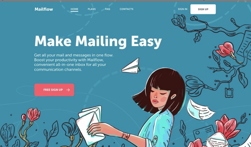
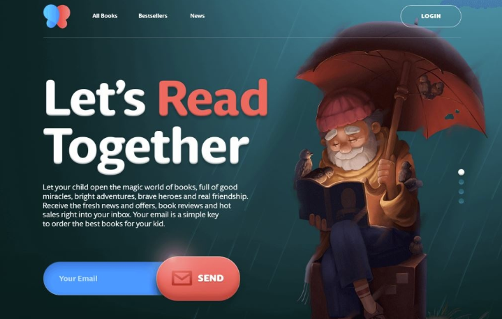
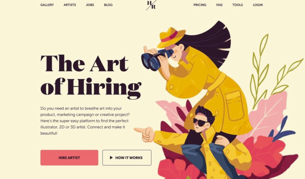
80% of visitors to your website will decide to stay or leave based solely on the hero section. It’s the first impression that sets the tone for user engagement. No matter how much effort you give to design the landing page, if the hero section fails, your landing page will ultimately fail.
Therefore, if you want your visitors keep reading your landing page and stay longer time, the hero section should be written and designed perfectly. Let’s discuss about some hero section best practices.
The objective of a landing page hero section is to entice people to keep scrolling & give reasons to spend some time on the page.
Hero section headline
The headline of the hero section tells the users what the landing page is all about. It is the primary, attention-grabbing text that communicates the core message or value proposition to visitors as soon as they land on the page.
A headline may have below features:
- Clear, concise & easily readable
- Addresses user pain points
- Gives value proposition
- Offers something special
- Attention-grabbing
- Aligned with the page’s goal or offer
- Creates a sense of urgency or curiosity

Tips to write highly engaging headline
- Keep it short: It should be easy to read and understand in just a few seconds
- Include numbers: Headlines like “Increase Sales by 50% in 30 Days” are more concrete and attention grabbing.
- A/B testing: Test different variations of the headlines to find out which one performs best.
- Use power words: Words like “exclusive,” “proven,” or “guaranteed has emotional impact on the users.
- Promote positive benefits: Use words like ‘ make more money’ instead of saying ‘stop loosing money’.
Headline case study
A study conducted by Unbounce revealed that headline with a positive benefit version has more conversion compared to question or negative loss version of headlines. Below is an example based on the case study.
| Headline type | Headline | Conversion |
| Question | Want to make more money in business? | 100% |
| Benefit | Make more money in business – secret tips! | 141% |
| Loss aversion | Stop loosing money in business – secret tips! | 111% |
The heading of the hero section should be concise and it may address users’ pain, offer something special, grab immediate attention and create a sense of urgency.
Supporting Text
The quality of the supporting text will determine whether the users will skim through the headings of the landing page or they’ll read the content. Below are the features of a well written supporting text.
Clarifies the headline: Expands on the headline by providing additional context or details about the offer or message.
Concise and to the point: Uses short, direct sentences to quickly convey the key information without overwhelming the reader.
Focuses on benefits: Highlights how the product or service solves a problem or improves the user’s life, emphasizing value over features.
Supports the CTA: Reinforces the call-to-action by explaining why users should take the next step, making the offer more compelling.
Easy to read: Uses simple language and formatting to ensure that visitors can quickly grasp the message, enhancing overall readability.

Supporting text is the continuation of the headline that provides additional context, clarifies the offer, highlights the benefits & supports the CTA.
Visuals
Images or videos are great to grab the attention of the viewers. Hero section visuals should have below features to be impactful.
Supports brand identity: The colors, style, and tone of the visuals should be consistent with the brand’s overall identity, enhancing recognition and trust.
Emotionally engaging: Visuals that evoke emotions like excitement, trust, or curiosity can draw visitors in and make the message more impactful.
Mobile-friendly and responsive: Ensure the visuals are optimized for all screen sizes and look great on both desktop and mobile devices.
High-quality and professional: The visuals should be sharp, clear, and visually appealing to create a strong first impression.
Relevant to the offer or message: The images or videos should align with the content, directly supporting the headline and conveying the value of the product or service.
Visuals should be emotionally engaging, consistent with the branding elements, responsive & relevant to the offer.
Call to action ( CTA)
CTA buttons are the reasons why a landing page exists. Below are the key features of a hero section CTA button:
Prominent placement: The CTA should be easily noticeable, ideally positioned above the fold or in a location where it naturally catches the eye.
Contrasting colors: The button should stand out from the surrounding elements through the use of contrasting colors, making it easy for visitors to identify.
Mobile-optimized: Ensure that the CTA is easily clickable on mobile devices, with a size that accommodates touch interactions without frustration.
Offer or Sense of urgency: Offer something such as ‘avail a free trail’ or incorporate phrases that create urgency, like “Limited Time Offer” encouraging users to take immediate action.

CTA should be placed prominently, should have contrasting color, optimized for mobile and offer something great to give the users reason to click.
Conclusion
Designing a landing page require skill and experience. However, it’s not rocket science. If you’re doing it for the first time for your business, it’s better to take a professional service. Consult with a landing page design expert before launching it and investing money on the landing page.
Related articles:
1. What is a landing page?
2. Elements of a landing page.
